

Sankey Widget
-
-
 Sankey DiagramA Sankey diagram is a powerful visualization tool used to illustrate flows and their proportions across a system. It features nodes connected by arrows or lines, where the width of each line represents the magnitude of the flow. This intuitive design allows viewers to quickly grasp the distribution and movement of resources, energy, or any measurable quantities. Sankey diagrams are particularly valuable for highlighting inefficiencies, bottlenecks, or imbalances within processes, making them a popular choice for analyzing energy systems, financial transfers, or supply chain dynamics.
 -
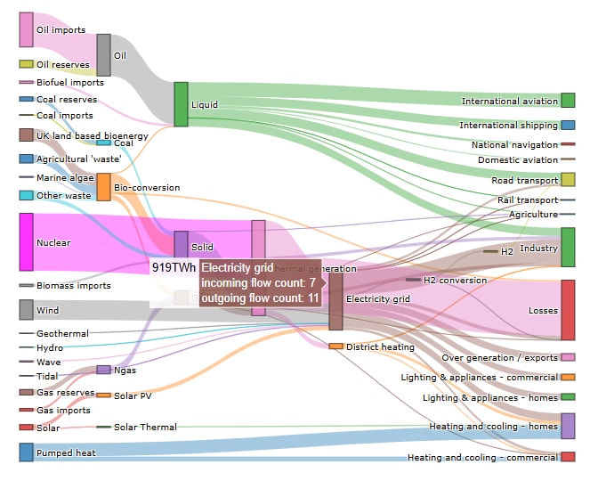 Complex energy transformation sankey diagram.
 -
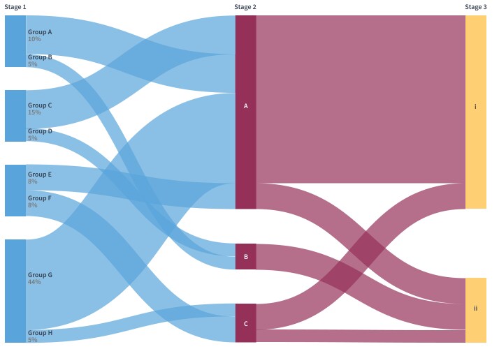 Alluvial diagrams use ribbons and have stages at regular intervals.
Sankey diagram is a data visualization type that depicts flows of any kind and their quantities in proportion to one another. It consist of nodes connected by lines or arrows. The width of the lines in this chart type depends on the amount of flow from source to target: the bigger the quantity, the wider the line. Sankey diagrams are often utilized to visualize the transfer of energy and some other resources. test
N4.8+
The widget is included in the Data Analytics and Visualization library, and purchasing it provides access to all widgets in the library. Two types of licenses are available: one for JACE and another for Supervisor. There are no restrictions on the number of widgets or bindings you can use.
The widget is part of the Data Analytics and Visualization library, and its purchase grants access to all widgets within the library.
| Versions | Price |
|---|---|
| Sankey Widget-JACE | $598.00 |
| Sankey Widget-Supervisor | $1,555.00 |
Question: Do you provide a free trial version?
Answer: Yes, please message us or send an email to support@baudrate.io. Make sure to include your Niagara Host ID so we can generate a trial license for you promptly.
Question: Does this widget support real-time data, historical data, or both?
Answer: The widget is designed to support real-time data, such as Numeric Points. While it is technically possible to use historical data, this is not recommended due to the nature of the widget.
Question: Is it possible to customize various aspects of the widget, such as its size, shapes, colors, and fonts?
Answer: All visual elements are fully configurable in the Niagara PX Editor, with context help available for every configuration attribute.
Please email us to support@baudrate.io if you have any questions
Explore all Sankey Widget images and videos
View Gallery-
 3D Widget by BaudrateThe Baudrate 3D Widget for Tridium Niagara 4 allows you to visualize and control building management...Price $1,555.00
 -
 Data Analytics and Visualisation Library by BaudrateBaudrate Data Analytics and Visualisation Library or DAV is a high-level interactive plotting librar...$598.00 - $1,555.00
© 2024 Tridium Inc. All rights reserved.
Tridium, Inc., is a wholly owned subsidiary of Honeywell International Inc.
