

Bar Chart Widget
-
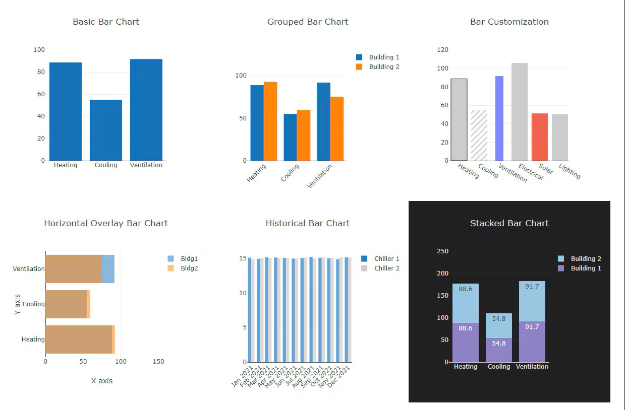 Bar ChartSimple Bar Chart – Displays single-variable data, ideal for sensor readings and energy use. Grouped Bar Chart – Compares multiple categories, useful for HVAC zones or building energy use. Stacked Bar Chart – Shows breakdowns within a total, great for energy or water usage analysis. Overlaid Bar Chart – Slightly overlapping bars for direct comparison of related data points.
Bar charts use vertical or horizontal data markers to compare individual values. You can use them to compare discrete data or show trends over time.
Grouped bar charts, also known as clustered bar graphs, multi-set bar charts, or grouped column charts, is a type of bar graph that is used to compare values across multiple categories.
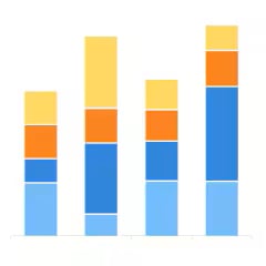
Stacked bar charts are useful for comparing proportional contributions within a category. They plot the relative value that each data series contributes to the total.
Bar mekko chart is a variable width stacked bar chart. Use a bar mekko chart as an alternative to a bar chart when you want to explain the impact.
Key features:
- unlimited number of numeric points or histories
- simple, grouped, stacked, overlaid bars
- vertical or horizontal mode
- static or animated
- any color scheme
- unlimited number of charts per host
- almost every chart aspect can be customized
- based on a popular data analytics chart library Plotly.js
- automatic reporting and pdf generation
- interactive controls
- deploy on Supervisor or JACE
N4.8+
The widget is included in the Data Analytics and Visualization library, and purchasing it provides access to all widgets in the library. Two types of licenses are available: one for JACE and another for Supervisor. There are no restrictions on the number of widgets or bindings you can use.
The widget is part of the Data Analytics and Visualization library, and its purchase grants access to all widgets within the library.
| Versions | Price |
|---|---|
| Bar Chart Widget-JACE | $598.00 |
| Bar Chart Widget-Supervisor | $1,555.00 |
Question: Which charts will I get after the purchase?
Answer: The widget is part of the Data Analytics and Visualization library, and its purchase grants access to all 40 widgets within the library.
Question: Do you provide a free trial version?
Answer: Yes, please message us or send an email to support@baudrate.io. Make sure to include your Niagara Host ID so we can generate a trial license for you promptly.
Question: Is it possible to customize various aspects of the widget, such as its size, shapes, colors, and fonts?
Answer: All visual elements are fully configurable in the Niagara PX Editor, with context help available for every configuration attribute.
Please email us to support@baudrate.io if you have any questions
Explore all Bar Chart Widget images and videos
View Gallery-
 Open Charge Point Protocol (OCPP) Driver by BaudrateThe driver is designed to enable communication between an electric vehicle charging point and Tridiu...$1,080.00 - $5,269.00
 -
 Automated Logic WebCTRL Driver by BaudrateALC driver for Tridium Niagara communicates with ALC controllers indirectly via WebCTRL server &ndas...$1,080.00 - $5,269.00
 -
 Data Analytics and Visualisation Library by BaudrateBaudrate Data Analytics and Visualisation Library or DAV is a high-level interactive plotting librar...$598.00 - $1,555.00
 -
 Sankey Widget by BaudrateSankey diagram is a data visualization type that depicts flows of any kind and their quantities in p...$598.00 - $1,555.00
 -
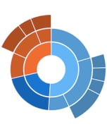 Sunburst widget by BaudrateSunburst widget displays hierarchical structures, for example energy consumption per type, per equip...$598.00 - $1,555.00
 -
 Schneider EcoStruxure Client Driver by BaudrateDriver allows Niagara to communicate with automation stations, discover / read / write to points in ...$1,080.00 - $5,269.00
© 2024 Tridium Inc. All rights reserved.
Tridium, Inc., is a wholly owned subsidiary of Honeywell International Inc.
